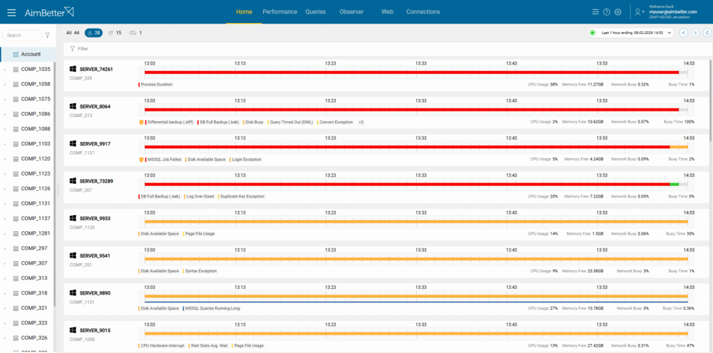
The Home Screen is the first page you see when logging in to AimBetter. It provides a real-time overview of your system’s health and status over the last 60 minutes, highlighting any alerts that require attention.
On this page, you see an overview of your system status and health over the past 60 minutes, with all alerts requiring attention highlighted.
System Status Overview
At a glance, the Home Screen shows the overall condition of your monitored environment using color-coded severity levels:
- Green – No issues detected
- Yellow – Low-severity alerts
- Orange – Medium-severity alerts
- Red – Critical-severity alerts
- Blue – Change Tracking or query-related alerts
These colors are used consistently across the dashboard to help you quickly prioritize issues.
Top Bar Elements

Collapse Button
![]() Clicking the Collapse button expands or collapses the left sidebar, which lists all managed companies, servers, and database instances.
Clicking the Collapse button expands or collapses the left sidebar, which lists all managed companies, servers, and database instances.
Modules Navigation
![]()
The Modules navigation allows you to move between AimBetter’s main functional areas. Each module focuses on a different aspect of system monitoring and analysis:
- Performance – View real-time and historical performance metrics for servers and databases, including CPU, memory, disk, and network utilization.
- Queries – Analyze database queries, identify long-running or blocking queries, and investigate query-related alerts and performance issues.
- Observer – Monitor system behavior, configuration changes, and operational events to better understand how changes impact performance and stability.
- Web – Track web server activity, availability, response times, and web-related alerts.
- Connections – Monitor active connections, connection trends, and connection-related alerts across your environment.
Clicking a module name immediately navigates you to the selected module, while preserving the current account, server, and time-range context.
Latest Actions
![]() This icon opens the Latest Actions window, showing the status of actions requested via the Responsive Agent feature.
This icon opens the Latest Actions window, showing the status of actions requested via the Responsive Agent feature.
Possible statuses:
- Waiting – The action was requested but not yet triggered
- Running – The action is currently in progress
- Success – The action completed successfully
- Failed – The action could not be performed
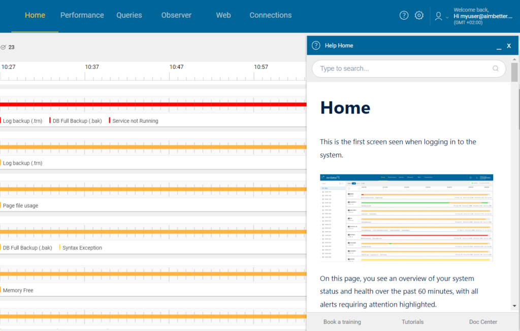
Help Button
![]() Clicking Help opens a contextual side panel with explanations relevant to the page or tab you are currently viewing.
Clicking Help opens a contextual side panel with explanations relevant to the page or tab you are currently viewing.
Settings Button
![]() The Settings button allows you to configure notification rules and alert exclusions. For full details, refer to the Settings Menu section of this guide.
The Settings button allows you to configure notification rules and alert exclusions. For full details, refer to the Settings Menu section of this guide.
Filters and Time

Server Status Filter Icons
![]() These icons filter the server alert bars based on their status within the selected time range:
These icons filter the server alert bars based on their status within the selected time range:
- All – Displays all servers in the selected layer
- With Alerts – Shows only servers that have triggered one or more alerts
- Without Alerts (OK) – Displays servers with no alerts
- Not in Sync (Unsync) – Shows servers that are not synchronized or have monitoring communication issues
These filters help you quickly narrow the view to servers that require attention
Calendar (Time Range Selection)
![]() By default, the Home Screen displays data for the last hour. You can now expand your analysis well beyond a single hour.
By default, the Home Screen displays data for the last hour. You can now expand your analysis well beyond a single hour.
Extended Time Range for Alerts

You can select any time range of up to one month to view triggered alerts.
This is especially useful when investigating recurring or intermittent issues, as it allows you to:
- Identify alert patterns over time
- Correlate events across servers and components
- Pinpoint when a problem first appeared or when its behavior changed
To change the time range:
- Click the calendar icon at the top right
- Select the desired start and end time (up to one month)
- Click Apply, then Set
All alerts and metrics on the screen will update to reflect the selected period.
Navigation and Live Data Icons
![]() Next to the calendar, you’ll find navigation and refresh controls:
Next to the calendar, you’ll find navigation and refresh controls:
- Back – Move one step backward in time
- Forward – Move one step forward in time
- Reload – Refresh the currently displayed data
Live Data Mode
When a green dot appears inside the Reload icon, clicking it switches the dashboard to live data mode.
- Live mode is indicated by a flickering dot inside the calendar
- In live mode, the dashboard continuously updates with the most recent data
These controls make it easy to move between historical investigation and real-time monitoring.
Alert Filters
![]() The Filter control lets you refine alerts across all servers simultaneously based on the selected time range.
The Filter control lets you refine alerts across all servers simultaneously based on the selected time range.
You can filter alerts by:
- Alert – Select specific alert types (for example: CPU, Disk, Query)
- Only alerts that occurred during the selected time range appear in the list
- Level – Filter by severity (Critical, Medium, Low, Informational)
- Risk – Show only alerts marked as security risks
- Status – Filter alerts by state (Active or Ended)
These filters are especially useful when investigating environment-wide issues, such as identifying all active critical CPU or disk alerts across multiple servers.
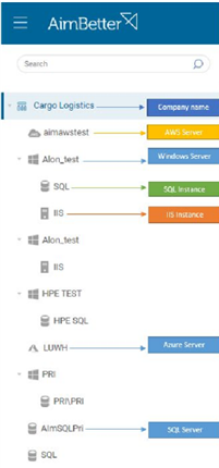
Account and Server Hierarchy

The left sidebar contains the servers tree, which represents all monitored assets in a clear hierarchical structure. This tree is the primary way to select the scope of data displayed on the Home Screen and across all modules.
Servers Tree Structure
The servers tree is organized as follows:
- Account level – Displays all companies under your management
- Company level – Lists all servers and database instances that belong to the selected company
Click the arrow next to a company name to expand or collapse its servers and instances.
Selecting any node in the tree (company, license layer, server, or instance) immediately updates the main view so that all data, alerts, and metrics are shown only for the selected scope.
License Layers
If a company uses multiple license types, each type appears as a separate layer beneath the company.
This makes it easy to distinguish between monitored technologies and understand which capabilities apply to each server.
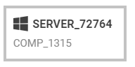
Platform icon
Beside each server, its platform can be easily identified by the icon on its side, as shown in the following image:
Single Server Details
When a single server is selected, additional investigation tools become available, allowing for deeper analysis of alert behavior over time.

The server’s name is displayed on the left side of the status bar, and beneath it is the company it belongs to.
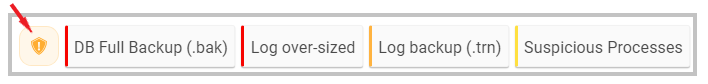
Beneath the status bar are the alerts that occurred in the selected period. The left border is colored based on the alert’s critical level. When a security-risk yellow icon appears at the beginning of this details line, it indicates that one of the alerts is related to a security risk.
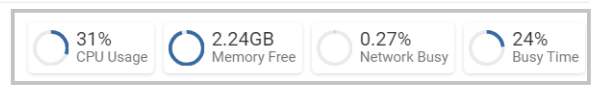
On the right side, beneath the status bar, there are metrics for the last minute: CPU Usage percentage, Memory free capacity, Network usage percentage, and Disk usage percentage.
Clicking a specific server bar displays more details about this server’s alerts for the selected period.

![]() A follow icon appears in each alert row. Clicking this icon makes the alert visible on the Home screen, regardless of the selected period. Some critical alerts are marked for follow-up as default, guaranteeing they won’t go unnoticed. They can also be unmarked for follow-up once the user decides they no longer need this reminder.
A follow icon appears in each alert row. Clicking this icon makes the alert visible on the Home screen, regardless of the selected period. Some critical alerts are marked for follow-up as default, guaranteeing they won’t go unnoticed. They can also be unmarked for follow-up once the user decides they no longer need this reminder.
![]() A security-risk icon appears next to alerts with a security risk that should be addressed promptly.
A security-risk icon appears next to alerts with a security risk that should be addressed promptly.
Hovering on the alert row, an AI icon and a Settings icon appear on the right.
![]() Clicking the AI icon opens the AI assistant side window, which provides an analysis of the alert.
Clicking the AI icon opens the AI assistant side window, which provides an analysis of the alert.
![]() Clicking the Settings icon opens the specific alert’s settings, which can be edited.
Clicking the Settings icon opens the specific alert’s settings, which can be edited.

Notice: When editing the alert, the new setting applies only to this alert’s specific server, not to all company servers.

 +1 (650) 449-8622